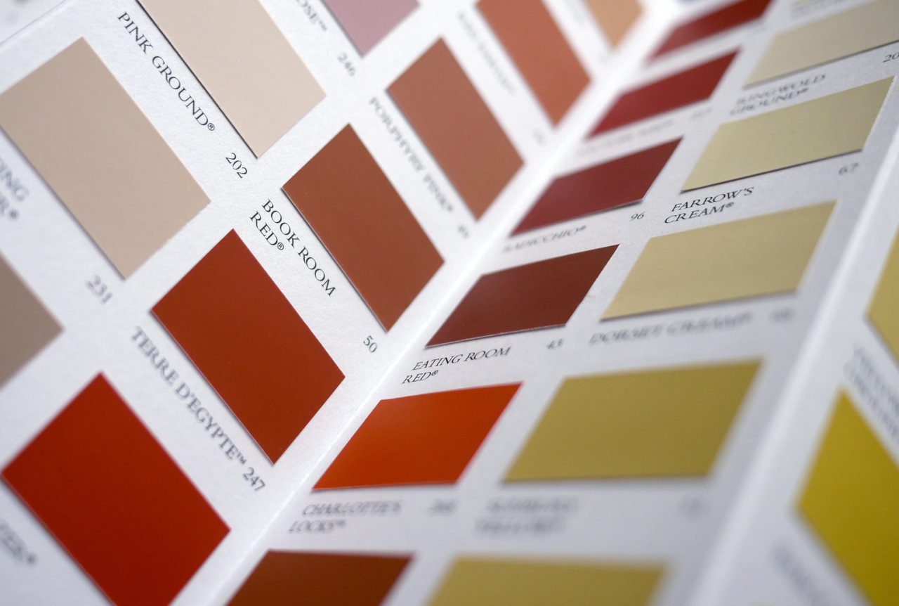
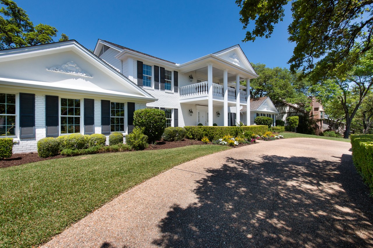
Step into a beach house decorated in soothing shades of blue or spend some time at a lively cocktail bar painted a vibrant shade of red and you’ll quickly notice how color affects your emotional state. The right paint color brushed on the wall doesn’t just change how a room looks, but also how it feels. This year, for its 2023 Colors of the Year, Valspar is tapping into color psychology to connect each color in the palette with a specific emotional state or quality you may be seeking. Want more joy? There’s a hue for that. Looking to restore balance? There’s a color to match.
“I believe that the colors are part of our core memory, reflecting the essence of the sensorial experience,” says Sue Kim, color marketing manager at Valspar. “The colors we choose for our home reflect how we want to capture those positive moments and make them a lasting experience at home,” she explains.
With 12 colors in total, the 2023 Valspar Colors of the Year palette ranges from familiar shades of creamy white to warm earth tones to reliable shades of blue. This versatile palette means you’ll find inspiration no matter your design style. The best part: if you’re an indecisive decorator, just let your mood—rather than your eye—guide the way. Find six of our favorite colors from the collection below. Get ready to paint your way to calm and contentment.

Photo by VALSPAR
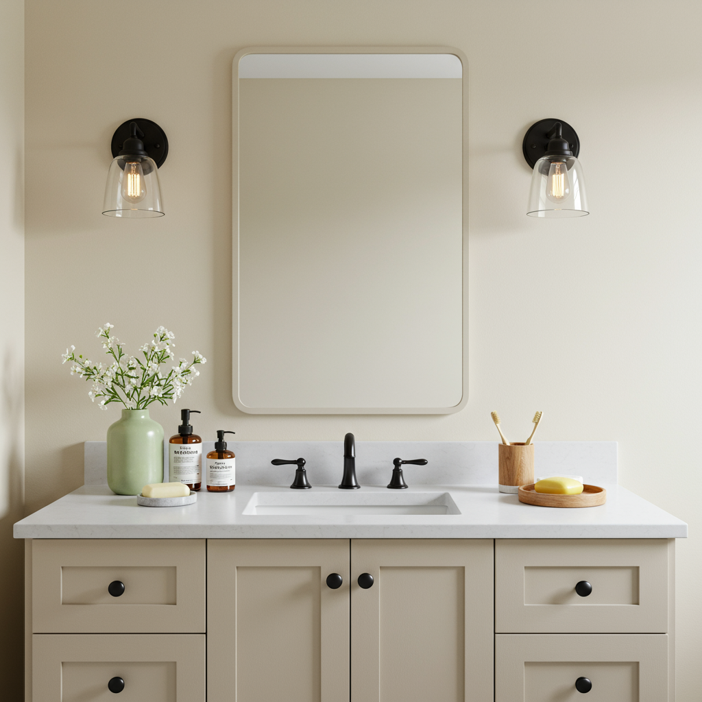
Cozy White
The vibe: Comfort
Familiar and tranquil, this warm shade of white evokes comfort and ease. For a more traditional kitchen, brush Cozy White on the cabinets. The warmth of this off-white will prevent the room from feeling too stark. For modern rustic style, pair this timeless hue with natural wood tones. The effect is a room that feels both relaxed and refined.
Photo by VALSPAR
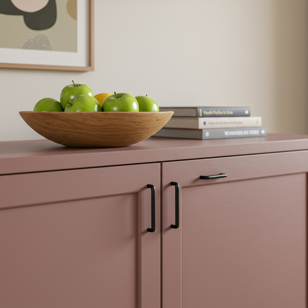
Southern Road
The vibe: Contentment
A muted shade of clay with brown undertones, this earthy hue reflects the desire to slow down and seek contentment with what we have. To feel more grounded in your home, paint Southern Road on the cabinets, an accent wall, or even an interior door.

Photo by VALSPAR
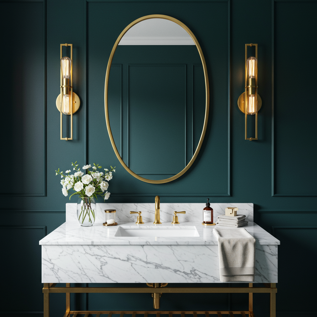
Everglade Deck
The vibe: Restored
When you feel like you’re running on empty, this is the hue to revive you. A rich midnight blue, Everglade Deck balances a calming depth with the energy of a bold color choice. For an elegant and elevated look, pair this color with brass fixtures that will sparkle against the dark blue backdrop.

Photo by VALSPAR
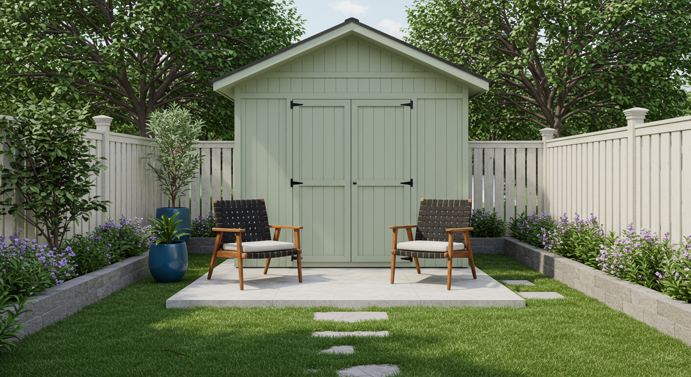
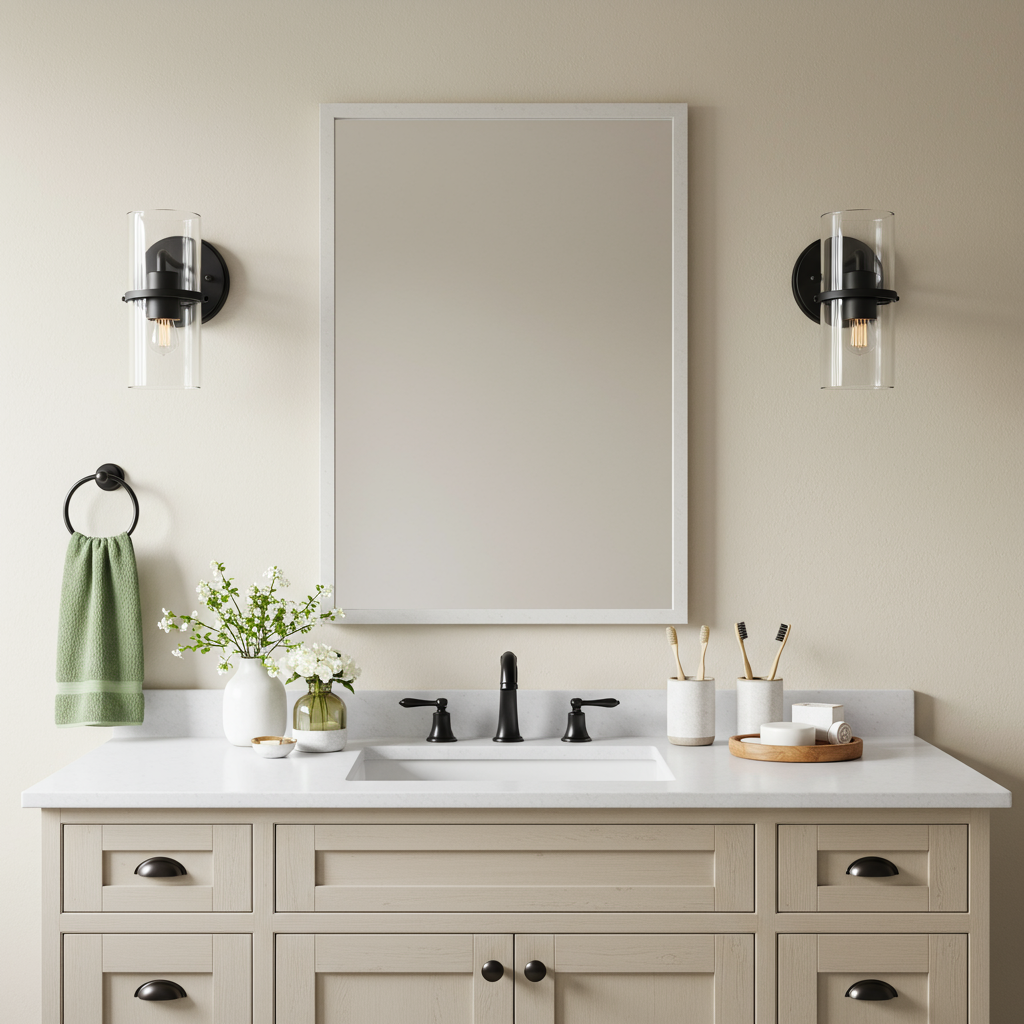
Green Trellis
The vibe: Calm
A fresh take on sage green, this mid-toned hue was picked directly from Mother Nature’s palette. The color pros at Valspar recommend pairing Green Trellis with contemporary elements, such as matte black hardware and modern furniture. When matched with darker shades of green, the visual effect is lush and layered.

Photo by VALSPAR
Holmes Cream
The vibe: Joy
When you want to wrap a room in warmth and happiness, this is the paint color you brush on the walls. A buttery shade of tan, Holmes Cream looks particularly at home when brushed on interesting architectural elements, like decorative molding or wainscoting. Pair this golden hue with crisp white trim for a dose of contrast.

Photo by VALSPAR
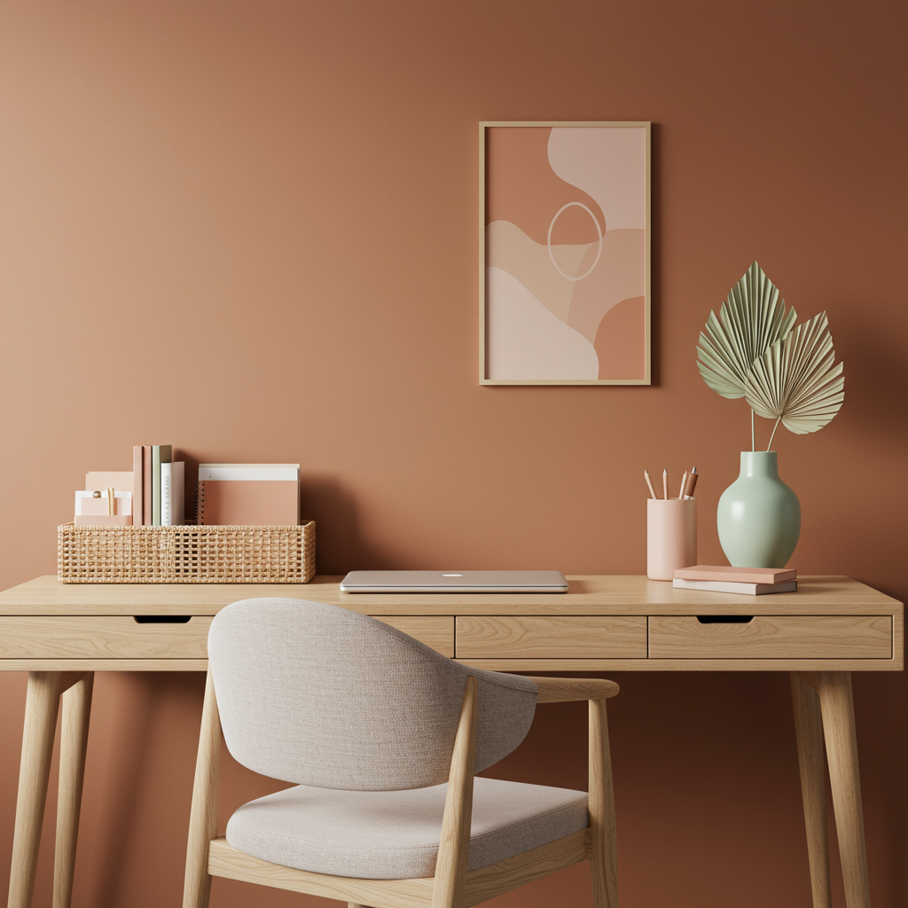
Desert Carnation
The vibe: Inspired
Feeling stuck in a creative rut? Looking to revamp a sleepy space? Desert Carnation has you covered. A soft, faded shade of terracotta, this color is laidback and welcoming, while expressing a strong sense of style. Let the desert landscape guide the design of the entire room, with light wood tones and accent pieces in hazy shades of green.


